Project Summary
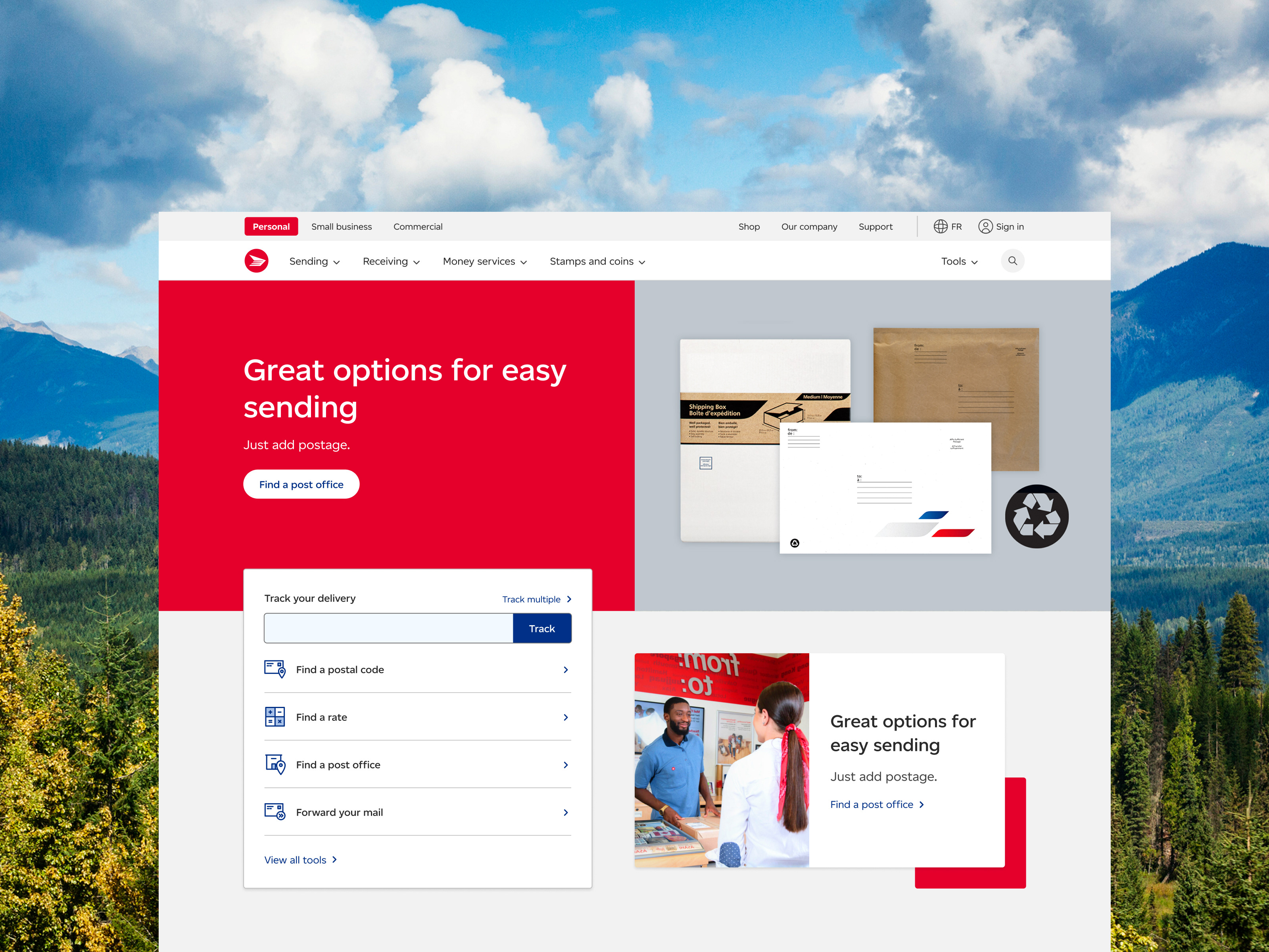
RBC Bank US wanted to create a website for Canadian expats and snowbirds living in the United States to manage their finances more easily. Once the user research was carried out by client, my team and I were in charge of designing the user interface in accordance with the bank's design language. Together with eye-catching images, consistent branding and web structure, I worked on the visual design from initiation to launch.
Deliverables:
• UI design
• Image sourcing
• Icons
• QA
Pages
The website consists of pages that provide the user with their specific banking needs. There is a clear hierarchy of information and content in order to guide the user through the site experience.
From the home page, the user can access quick links to main use cases, such as bank accounts, loans, credit cards and mortgages.
The U.S. Bank Accounts page aims to help Canadians feel at home in the States by presenting a variety options for cross-border banking. From this page, users can learn more about accounts with a comparison tool, videos and contacting their local branch.
Customers can simplify their cross-border lifestyle with RBC solutions. This page helps Canadians discover more about how to handle their financial needs whilst living, working and travelling in America.
Images were carefully selected to reflect the different customer scenarios: snowbirds, expats and travel.
RBC Online Banking
The team also worked on a customized web app that would function within the Cross-Border website. This tool was designed for snowbirds who need access to banking while living in the U.S. It was important to take into account how a retiree would sign up for online banking on mobile, so making it intuitive to this older age group was key.
Large buttons and a guided series of steps, together with a minimal layout was key to guiding the user.


