Background
When Canadians shifted to online shopping during the pandemic, they triggered an ecommerce boom with widespread changes for the industry. To match this incredible demand, the company took steps to deliver on its new purpose and transformation plan: A stronger Canada – Delivered. They changed the way they communicated by making Canadians the heroes of the story. This created the need for a fresh look and identity.
A large part of this brand initiative was the website, which serves millions of Canadians across the country. In 2016, Canada Post underwent their first website redesign. The lessons learned from this first iteration informed the new UXUI design and new brand identity. This gave us the opportunity to create an improved experience for many Canadians across the country.
Project details
From September 2021 - March 2024, I played a key role designing the new website from initiation to launch. The scope of this project was to deliver the branding and visual identity as part of the overall brand transformation program.
Adapted brand guidelines
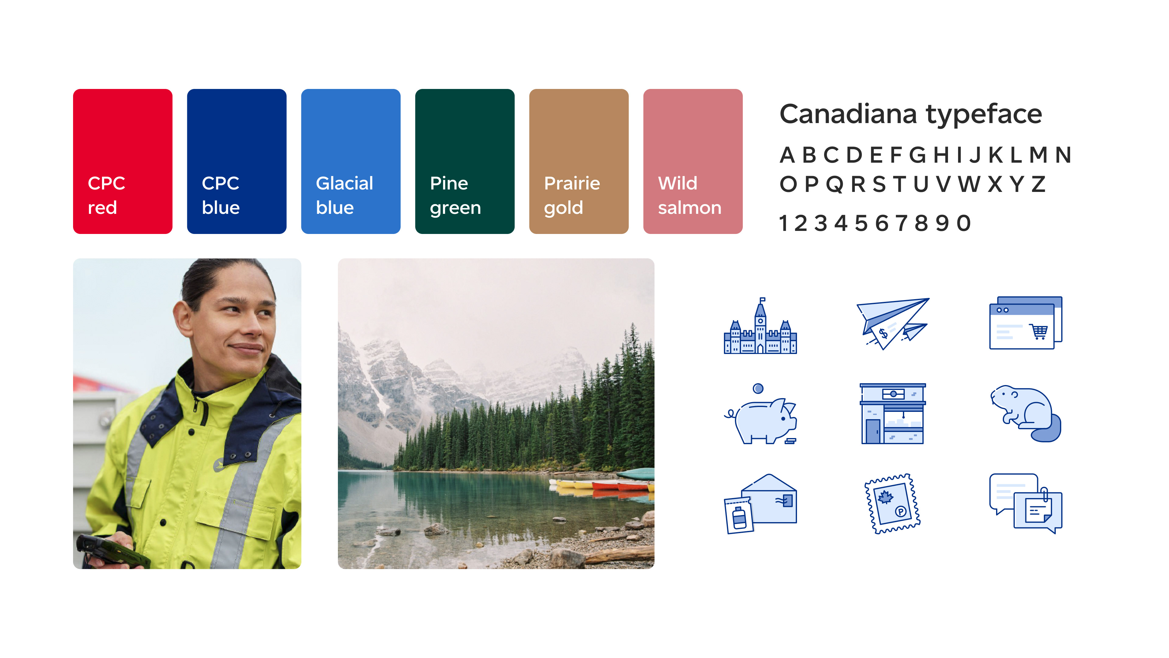
The new brand guidelines were adapted to suit the requirements for web accessibility, overall usability and brand tone. New colours, typography, photography and illustrations worked together to infuse new life into the company; to connect with a transformed landscape of Canadians and their postal and e-commerce needs.
The main identifiable colours were updated and the colour palette was expanded to reflect the Canadian landscape, with colours like pine green and glacial blue. These were tested for web colour contrast and adjusted them to suit accessibility standards. New photography direction was focused on creating a narrative with images of Canadians, landscapes and CPC employees and facilities, making Canadians the heroes of the story. A custom typeface, Canadiana, provided a more modern feel for the brand, and illustrations were updated with a monochromatic blue to feel more cohesive with text.
Reducing complexity
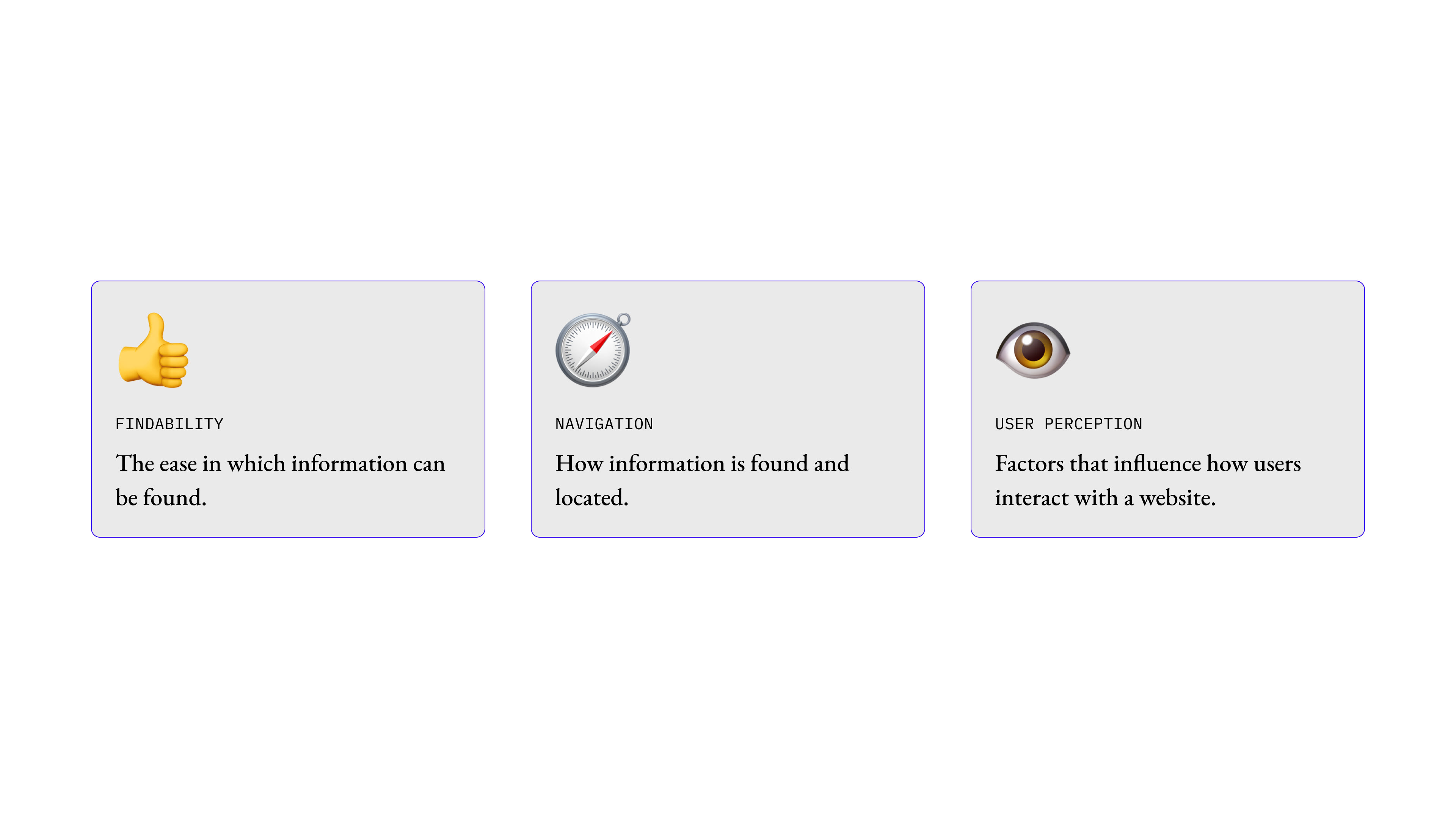
Some of the customer pain points that we addressed were findability, navigation and user perception. Our previous website design was very complex and difficult to navigate. It was overloaded with content, making it tricky for users to navigate to easily find what they needed.
The goal of the redesign was to remove these paint points and areas of frustration by addressing two critical areas:
1. Improving the overall usability and accessibility of the website experience.
2. Simplifying the information architecture of the site so that users can easily find what they’re looking for.
IA restructure
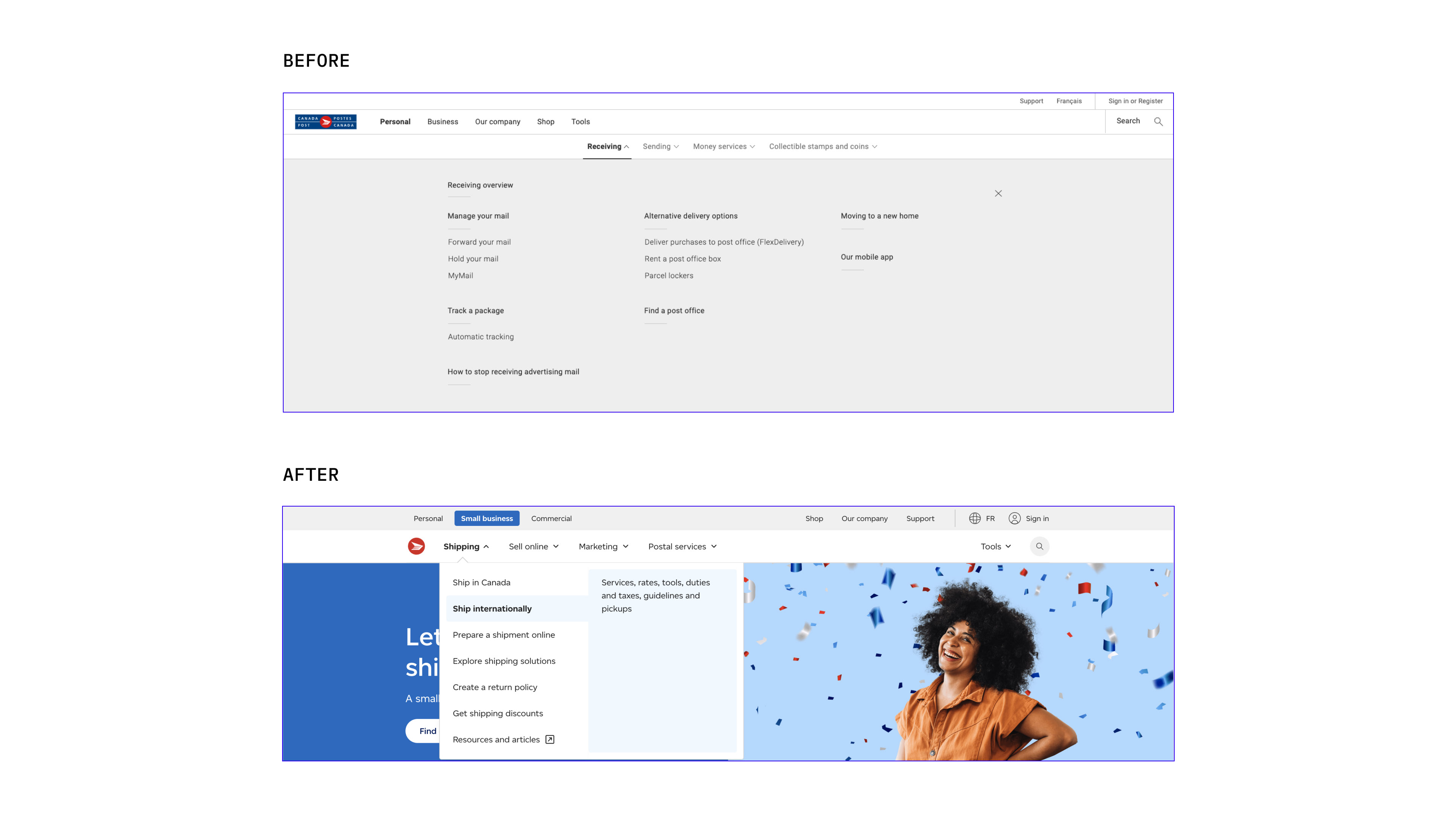
One of the biggest undertakings of the rebrand project was the new global navigation. This has been in the works for years, where the team began exploring new directions as early as 2019. This project was a massive collaboration between many ux team members. It was redesigned and reimagined in response to some hard learnings from the previous mega nav design.
The main issues were that is had too much information, making it visually cluttered and difficult to scan through. Also, people didn’t understand a lot of the terminology and labelling strategy. The team looked for ways to simplify and streamline the website to create a navigation that was intuitive for users and didn't overload them cognitively.
After many rounds of usability testing and a lot of ideation, the design was simplified to a dropdown menu – a drastic but much needed change. There were several key changes:
1. Adding descriptive text to each label to provide more context to Canada Post concepts, such as “Ship internationally”.
1. Adding descriptive text to each label to provide more context to Canada Post concepts, such as “Ship internationally”.
2. Splitting the Business into Small business and Commercial to better tailor the website to those distinct segments.
3. Moving from a 3-level hierarchy to a simplified 2-level navigation structure.
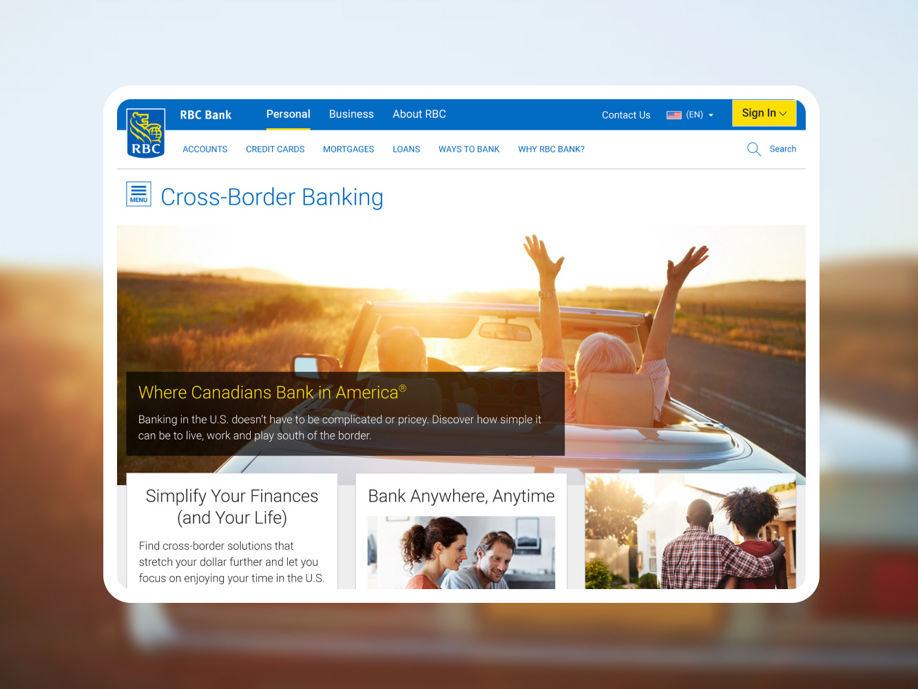
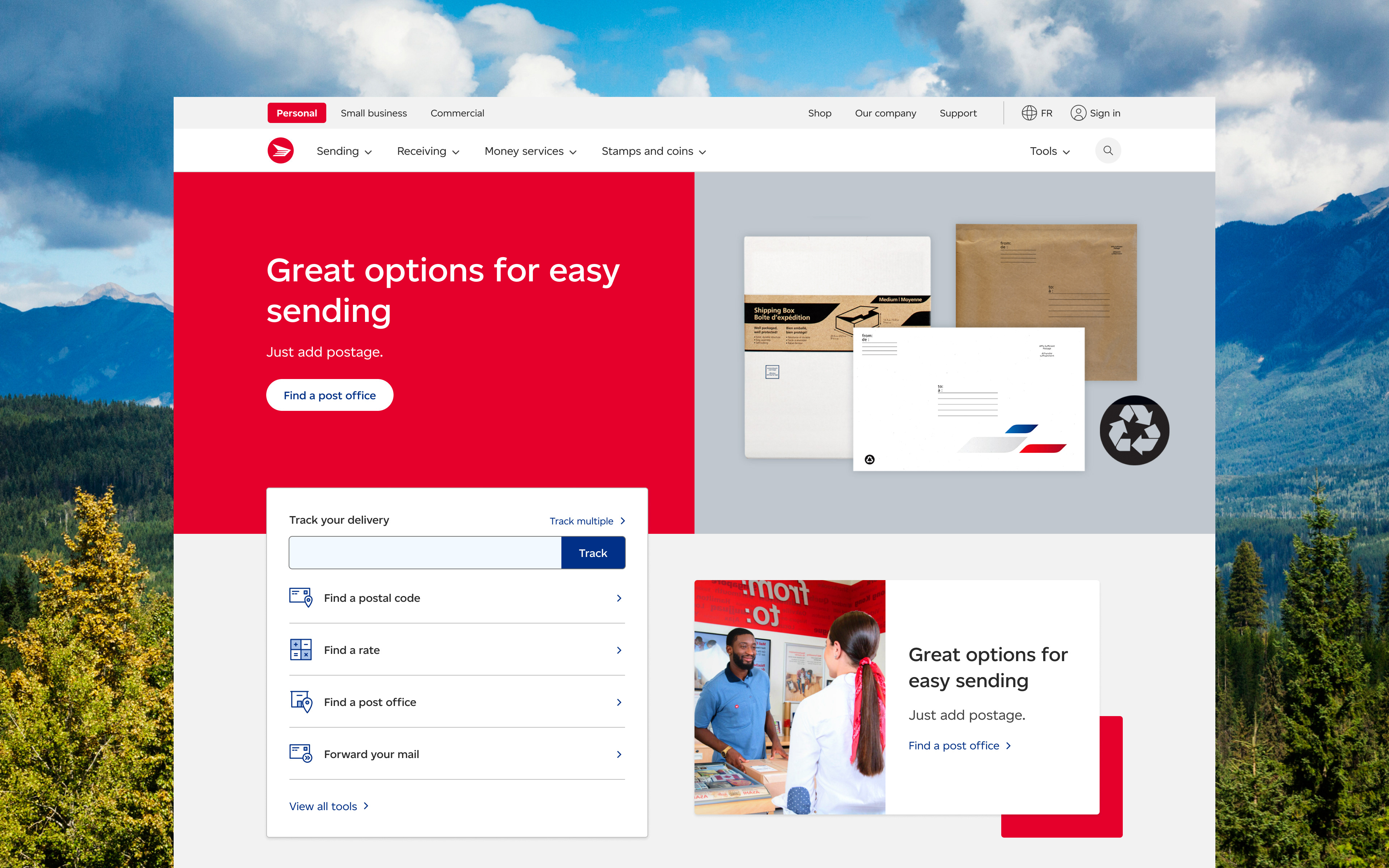
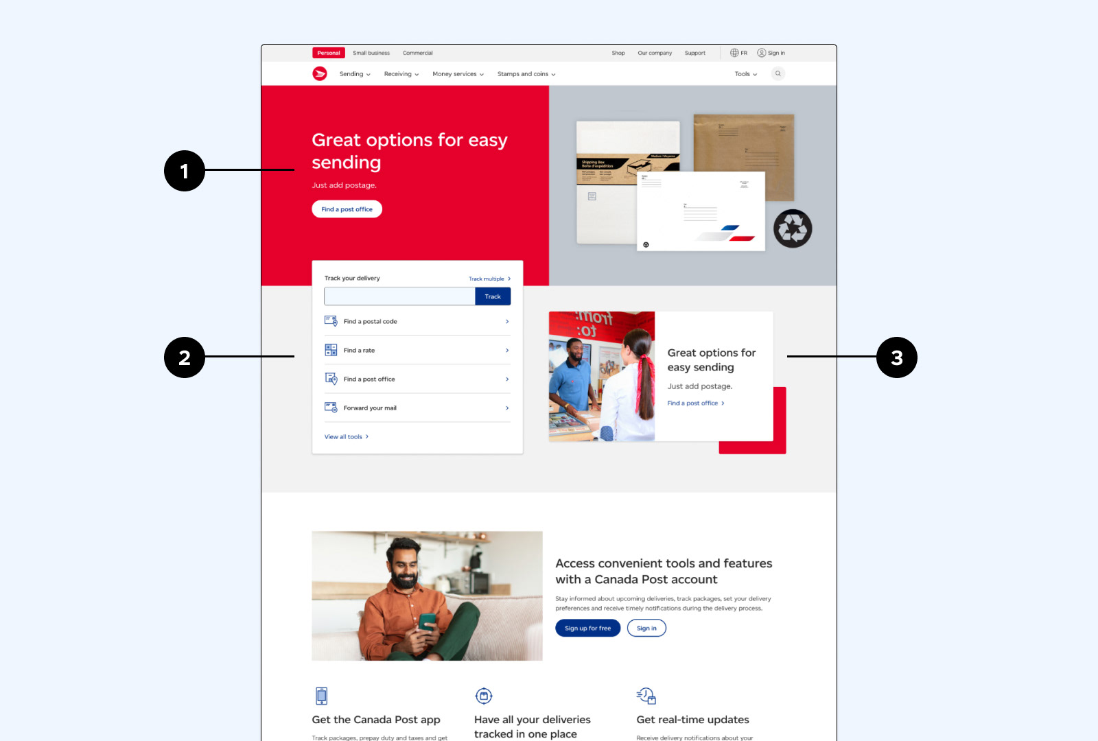
Designing the homepage banner
Improving the site’s information architecture also gave us the opportunity to uplift the landing pages. I worked on the hero banner of the homepage and landing pages. After a lot of iterations and rounds of feedback from the UX team and stakeholders, I delivered the final design.
The banner consists of three sections:
1. Hero banner with CTA and image The design is similar to our product pages, but we increased the height to establish hierarchy.
1. Hero banner with CTA and image The design is similar to our product pages, but we increased the height to establish hierarchy.
2. Track and tools card
Based on user feedback, we improved the readability by changing the layout to vertical.
3. Secondary content block
We saw an opportunity to surface corporate communications like stamp releases, in addition to the hero content.
Together with a dedicated team of designers, developers, QA analysts and accessibility specialists, we successfully deployed the new and improved website to millions of Canadians across the country in March 2024.
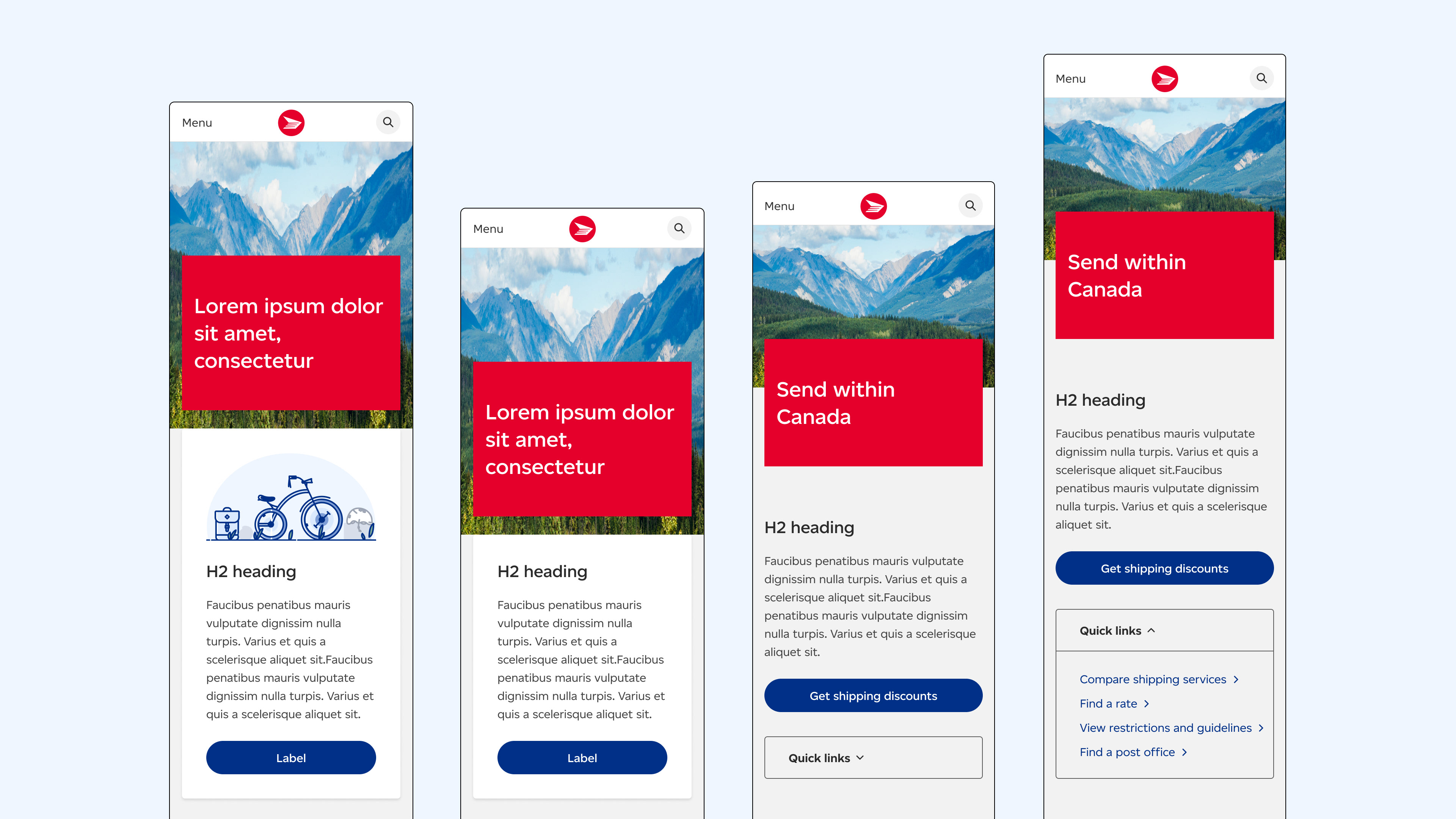
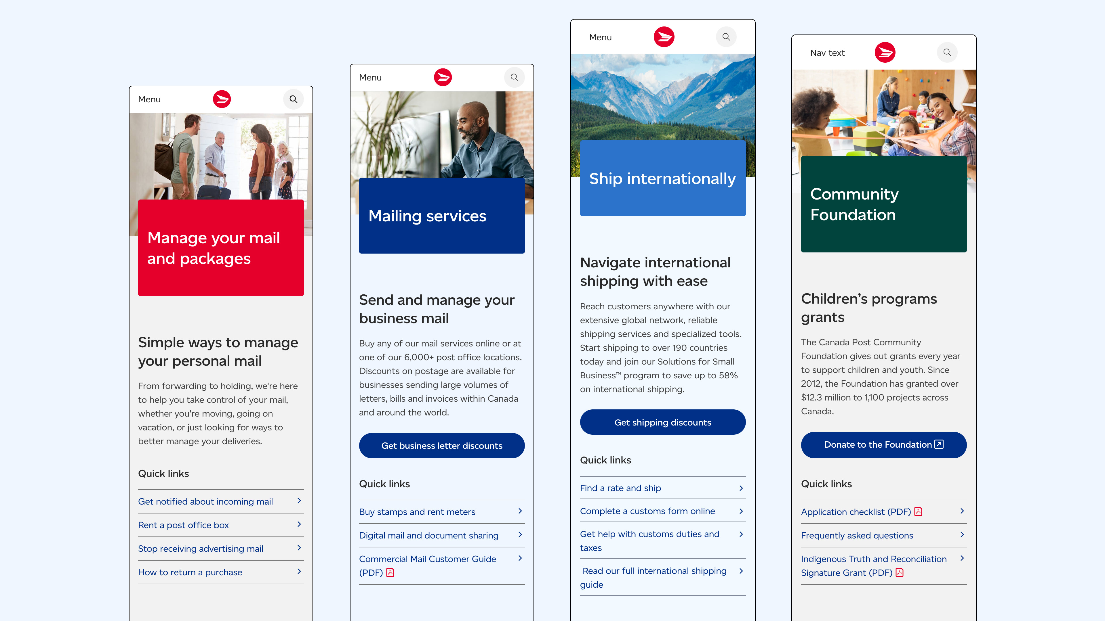
Mobile approach
Initially, we thought about incorporating illustrations into the funnel banner design to add some delight and showcase the new brand. But we quickly realized that it would take too much time to create net new illustrations for 60 funnel pages and they wouldn’t add any value to the page. I then explored designs without an illustration, with content in a block, but the h1 block was clashing with h2 block.
Then the team and I explored adding useful links to the banner as a way to better serve users. I thought about collapsing the information in an accordion, similar to the anchor links pattern on the product pages. But upon further consideration, we concluded that this pattern did not serve the same purpose. Also, the funnel pages were created to assist users with way-finding, so the content needed to be visible on smaller screens, despite the extra scrolling.
I worked with the content designer to create guidelines on what information should be added to the quick links. We looked at the goal of each page, and then we used that to inform what links would best serve users and the actions they would most likely take. What tasks are users trying to accomplish on each funnel page? What problem is the content on this page trying to solve?
In the end, we decided on a simple design with standalone links stacked vertically and arrows to assist the user. Below are final designs for each of the four user segments (personal, commercial, small business and our company).
Outcome
The newly branded website was launched in March 2024. As part of this huge initiative, I designed a total of 15 components and 36 pages. Page layouts were redesigned with attention to improving usability and accessibility, while managing business constraints and project scope. This was a massive change and it was incredible to see an entire company get on board for this amazing transformation.
You can view the new website at canadapost.ca